|
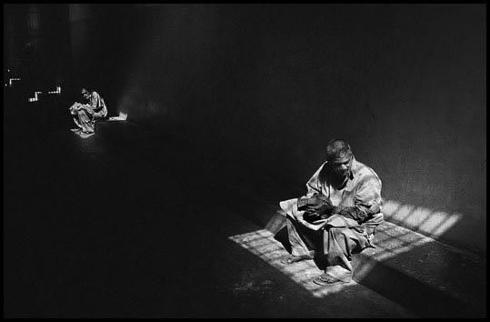
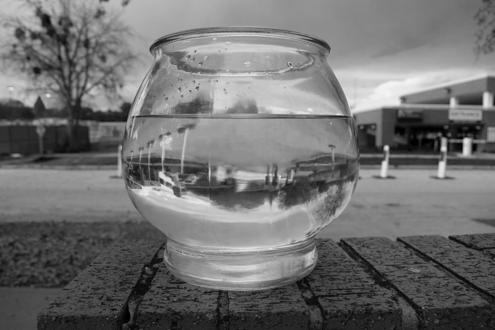
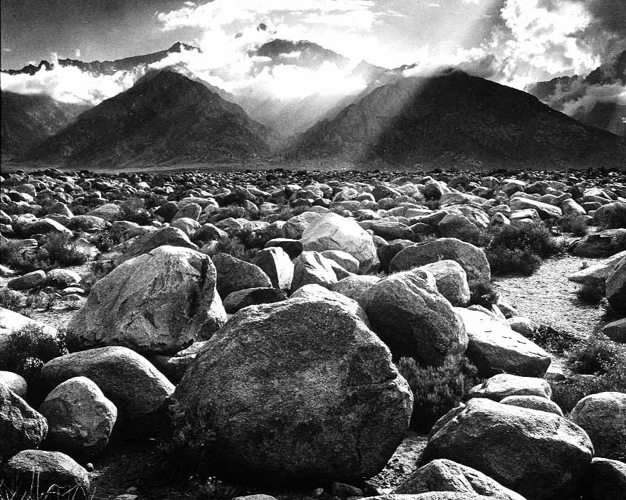
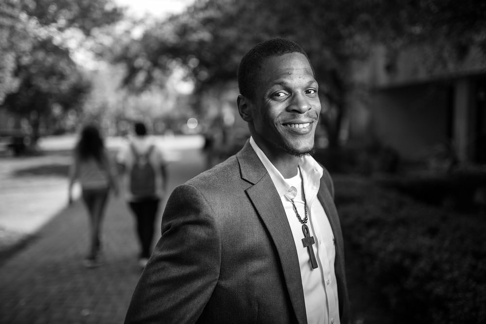
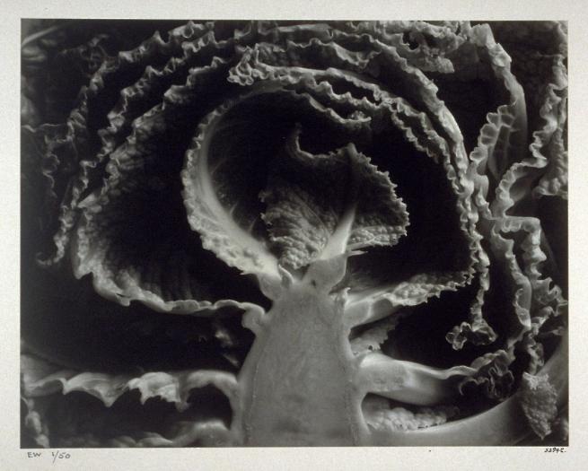
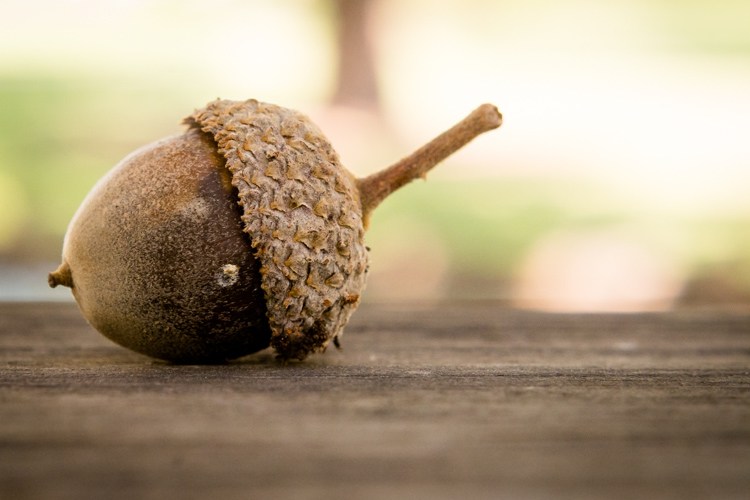
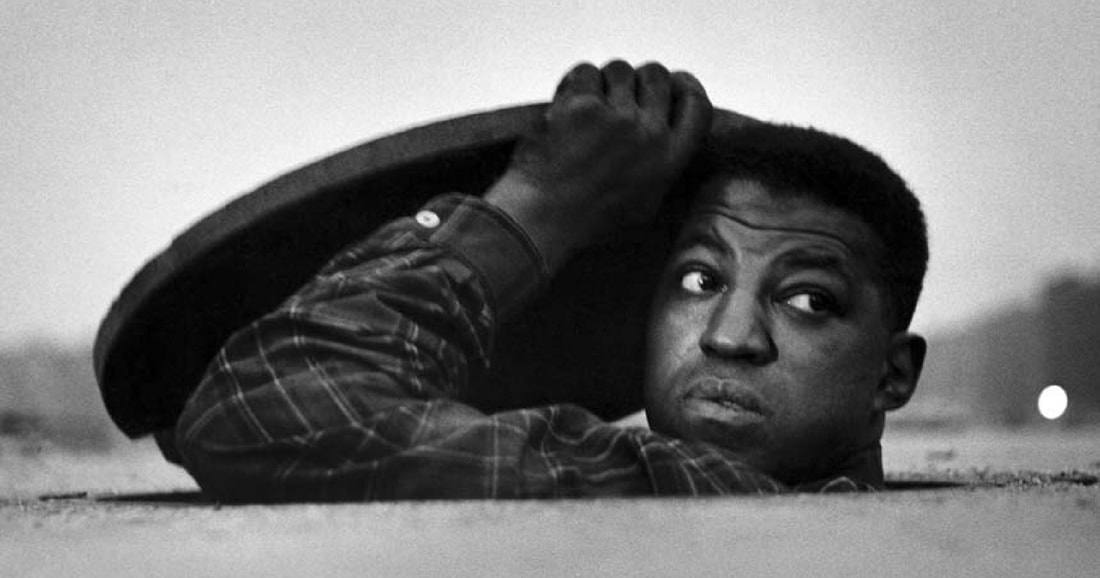
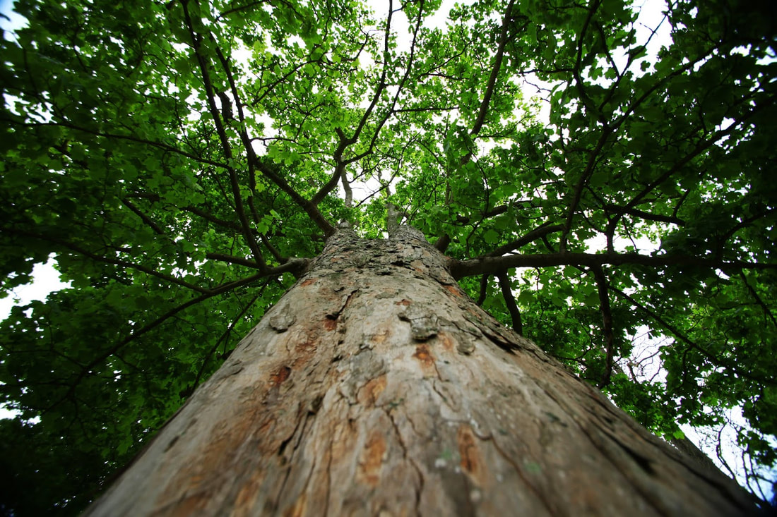
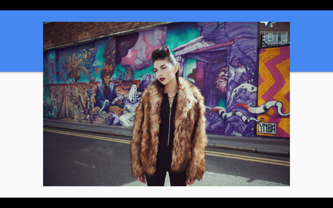
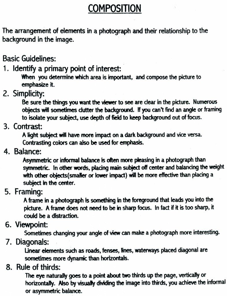
When it comes to taking "good" pictures, photographers really need to consider some key compositions to keep viewers engaged. Composition is the placement of elements in a frame to draw your viewer in and to create meaning. Some example compositions are listed and shown below. I have images that I find inspiring and then images that I've taken myself to show my understanding. RULE OF THIRDS
LEADING LINES
FRAMING
BALANCE
REPETITION
BACKGROUND
DEPTH
CROPPING
VIEWPOINT
0 Comments
Before we can take a picture, we have to consider the subject we're photographing and the type of lens that will best capture that subject in a flattering way. It is important to know that the lens on front of the camera bends and refracts light as it enters the camera and strikes the sensor. The photographer can chose how much the light is bent and what the effect is on the subject by choosing the right focal length for the job.
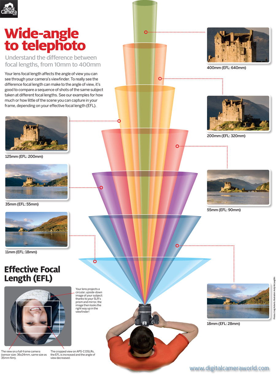
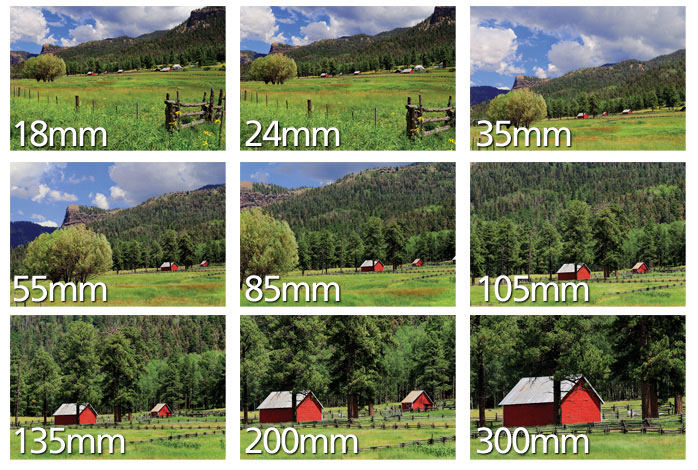
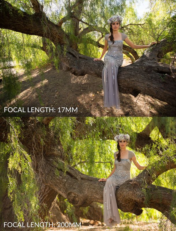
This is a crazy cool animation about focal length that I found online when creating this presentation. I embedded it here for you all to see. This animation shows the difference between a 20mm (wide angle lens) and a 200mm (telephoto lens). Notice how the subject's nose appears larger or smaller in relation to his/her cheeks and facial structure. When the camera is wide the subject appears to have more distortion in his/her face. However, when the camera is telephoto at 200mm the subject's face fills out more and appears more natural as if we were looking at him/her face-to-face.
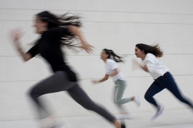
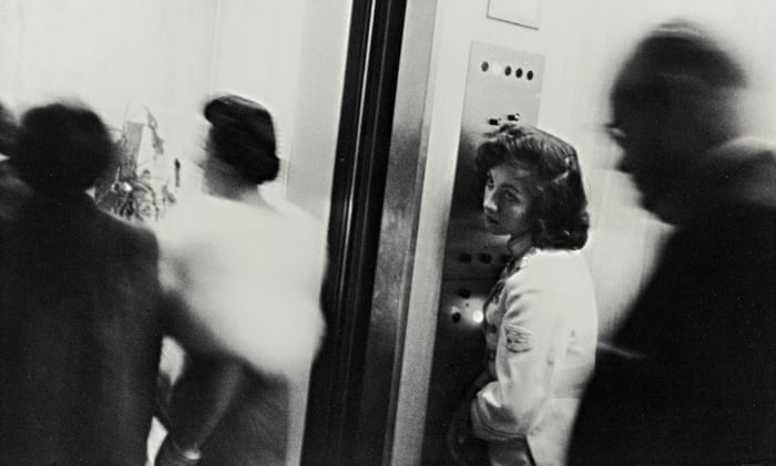
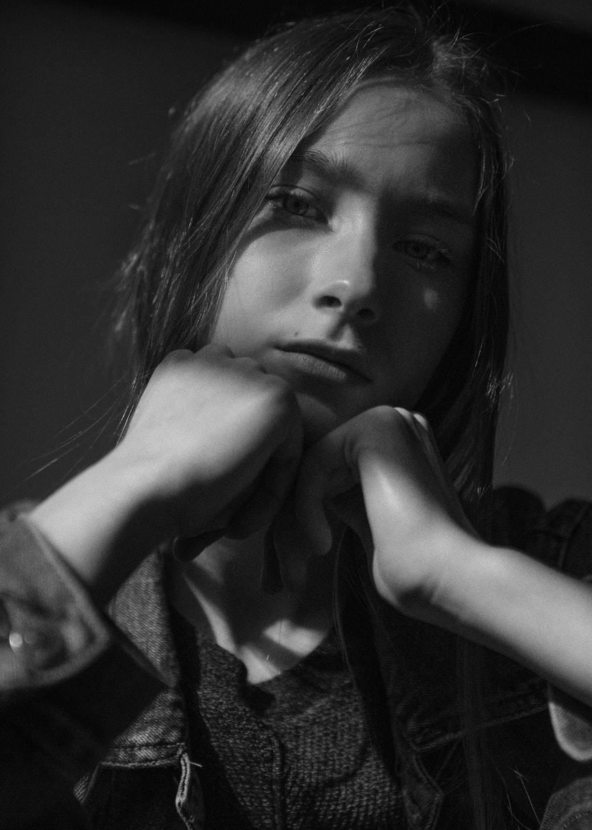
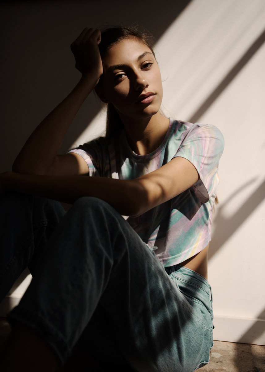
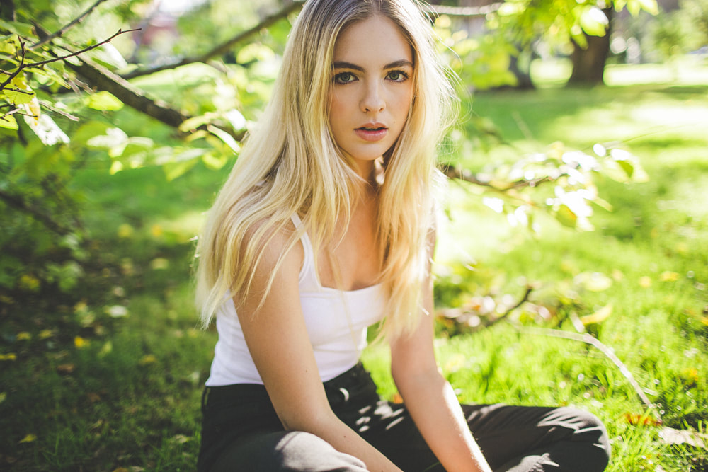
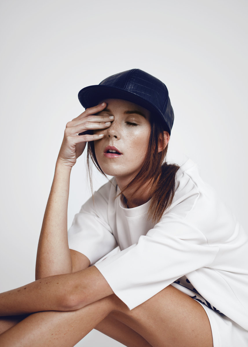
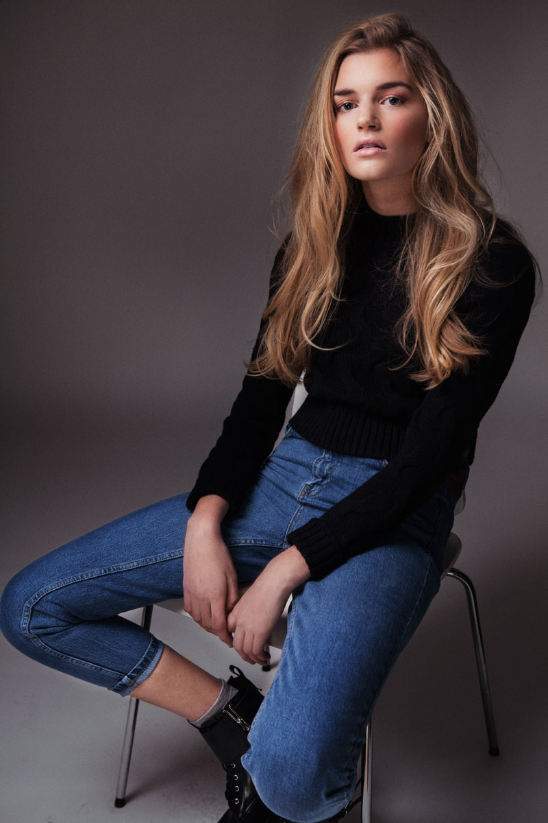
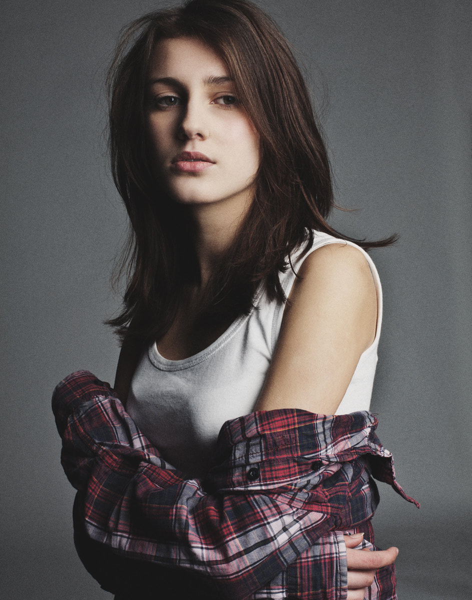
Capturing Movement: Exaggerating SpeedWhen we photograph a subject (any human subject) it is important to remember that their faces and their positioning says a lot about what they're thinking and feeling. It is critical to position your subject in a way that matches or enhances the lighting, environment, and atmosphere you're creating within your photograph; they must work together.
Sources
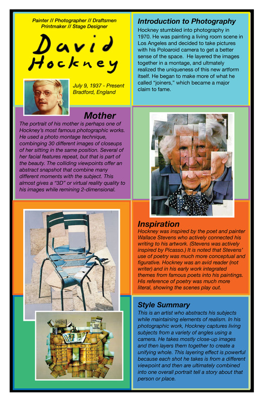
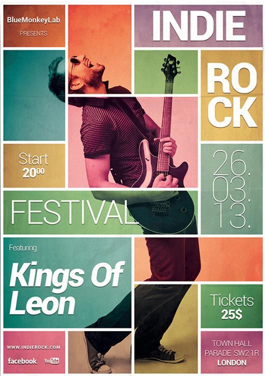
Most of the pictures come from the photographer Sandra Gorska; http://www.sandragorska.com/portfolio-2#44 These definitions came from the wonderful site: http://truecenterpublishing.com/photopsy/body_language.htm David Hockney is a famous artist who has worked with many mediums over his career. We are focusing on his work in photography, but in order to make a poster celebrating his overall style it is critical to study his painting work and unique vision. These images below helped to inspire the overall poster design I created--bright colors, bold blocks and shapes, little shading or grading, and so on. Designing a Poster The assignment is to study poster designs (in the world and online) that you like and that may reflect some of the style of your famous artist. You should find a poster design that ultimately will showcase your artist's work and then include enough room for information about his or her life. These are the picture elements I used in my poster design (shown at the bottom). See the images, including a portrait of the artist and then some of his most famous photographic works. The Digital Details The image at the bottom left is the poster I designed. The image at the bottom right is the poster I took inspiration from in order to create my own homage to David Hockney. I designed this poster in Photoshop; 11x17 300dpi and CMYK for printing. The final poster is saved as a JPEG for sharing here and a PDF for submission to the printer.
Finding Inspiration Going one step farther, this is a recreation of this famous artists style of work. This is a young man who took the idea of Hockney's photo montage portraits and created his own original in this style. The assignment for our shop is to create your own original David Hockney portrait using his photo montage technique. Before you begin, study his images in the slideshow above and on the poster. Get a good sense of how he captured his scenes. Then get to work finding a subject and location where the lighting remains the same for a long period of time as you will need to capture 30+ images of the same space for a variety of angles and focal lengths.  When you're first starting out using a DSLR (Digital Single Lens Reflex) or SLR camera, there are a lot of buttons to figure out. Especially in the digital versions. You should focus first and foremost on capturing nice compositions and worry less about the exposure. Tackle one thing at a time. Photography: Settings & Priorities
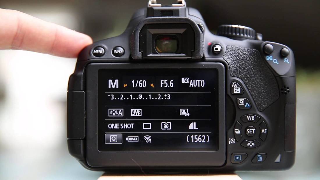 Important Settings to Note:
 No matter how much we deny it, photography is a science. The earliest photographers in history, the inventors of the craft we love so much, were all chemists and scientists experimenting with light and ways to record it.
To capture photographs that are true works of art and reflective of our artistic visions, we must master the science of exposure; capturing the correct exposure while using the settings we need. Looking over the examples above, let's break down the science:
The Struggle is Real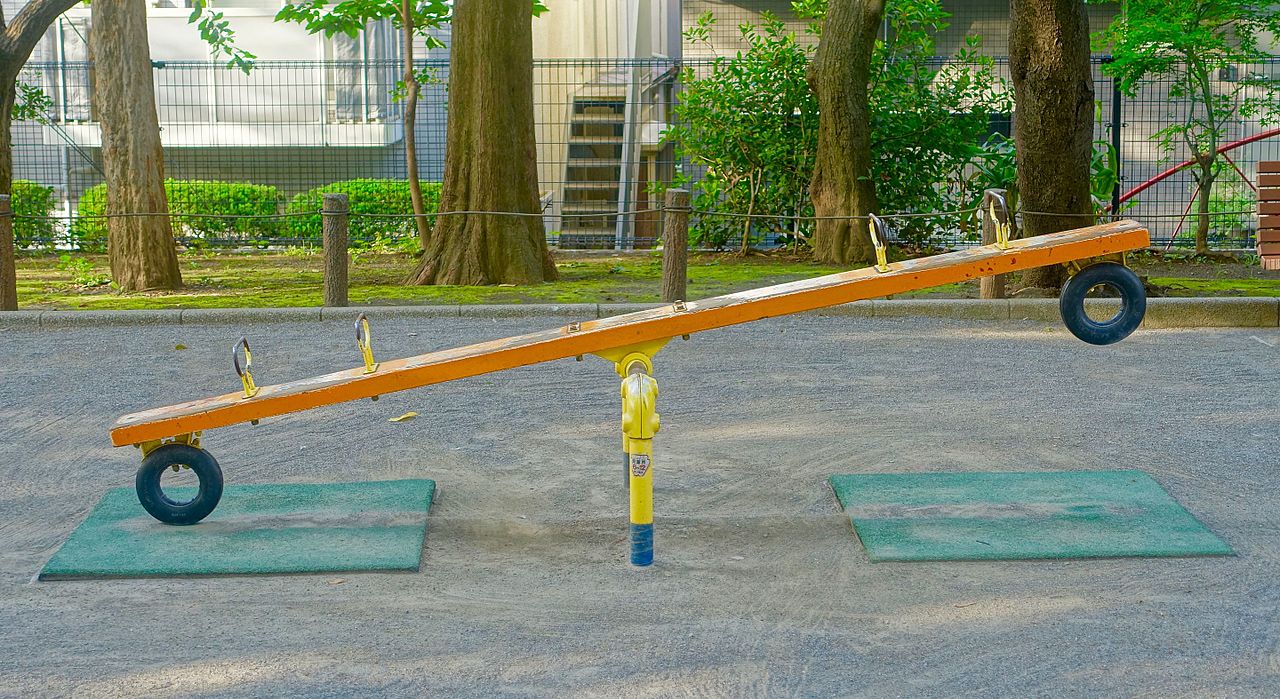 The seasaw above represents this scientific calculation, and here's how (see below). When trying to figure out how to balance art and science, it is important to learn the three elements that make up exposure, which are: ISO, SHUTTER SPEED, AND APERTURE 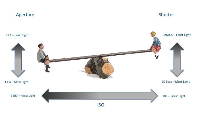 The seasaw is my favorite way of explaining exposure because it is simple. The photographer has one artistic element he or she typically tries to capture (example: shallow depth of field or freezing action). With this artistic goal in mind, the photographer sets the aperture or shutter speed for that choice, and then they must adjust the other two settings to create a balanced exposure. #compromise #givingin #youdontalwaysgetwhatyouwant #takingturns Metaphors = LifePretend--for a moment--that these three exposure settings are members of your family... (go with me for just a minute). Now, you're heading out to a restaurant for dinner with your exhausted mother, and no one agrees where to eat; 
|